The following post explores how Helpshift’s product management team has redefined traditional web chat to address our customers’ largest pain points. There are plenty of use cases for brands to continue providing real-time support, but we wanted to give them an alternative when live chat is not feasible or preferable.
Messaging platforms such as Whatsapp and WeChat have brought about a fundamental change in user behavior, one that resulted in conversations becoming asynchronous.
Mobile app users are increasingly embracing the idea of sending a message, continuing with their daily responsibilities, and returning to the app to check for a reply minutes or even hours later. At Helpshift, we started to wonder if this behavior would hold true for web chat as well.
Why We Prioritized Creating The Option for an Asynchronous Web Experience
Last year, we started collecting relevant data, and found that in a period of three months (Jan 1, 2018 to March 1, 2018), roughly 54 percent of website visitors that had sent a message to customer service did not see the reply. This meant that the user had left the web chat window and wasn’t present to read the response sent by the brand.
The conversation stopped, making it difficult to resolve issues without the user having to resend a message and start over.
A few of our brands figured out a workaround to re-engage users after they left web chat: agents would manually create an email issue and continue the conversation over email.
This can be a time-intensive and inefficient process.
The realization that a majority of web visitors were leaving web chat and that our customers had to manually create email issues prompted us to investigate and prioritize the web messaging experience. We realized we needed web chat to support both live and asynchronous messaging experiences, and began to solve for this as a team.
Here’s an example:
Imagine that a retail customer, Richard, orders a shirt and hasn’t received it yet. Already frustrated, Richard visits the retailer’s website, opens up the web chat widget and describes the problem with his order. Unfortunately, the support team is backlogged and can’t respond immediately, so Richard must choose between being the 15th in queue or returning later to start over. This is a poor user experience.
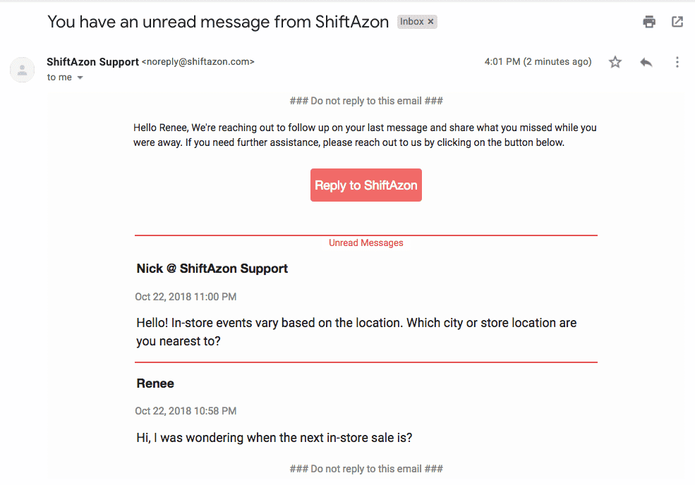
Now imagine if Richard was able to describe his problem in a message and then leave the browser. Then, when an agent becomes available, Richard gets an email notification with a link to the agent’s reply. The link takes Richard back to the messaging window, with the conversation history fully intact.
Richard and the agent can continue messaging back and forth at leisure until the issue is resolved, without Richard having to wait around in the browser or having to restart the conversation.
With asynchronous web messaging, brands can ensure that users’ problems get solved even if they are no longer available on web chat. Creating this experience became our new goal, and as a product manager, I’d like to walk you through my team’s process and the principles that shaped this capability.
Read more: Synchronous-vs-Asynchronous
How We Created Web Chat 2.0 in Seven Stages
Stage 1: Research
From our data on web chat usage, we knew that 54.2 percent of users were leaving web chat. This gave us insight into ‘what’ users were doing. However, it didn’t answer the ‘why’? Why were users leaving web chat? Were they leaving web chat because they didn’t get connected to an agent quickly? Were they leaving web chat because they didn’t like the agent’s responses? Were there other reasons for leaving web chat? To get to the root of the problem, we decided to conduct exploratory research with several customers in order to understand why users were leaving web chat and found two key reasons:
- Agent Availability: Brands told us that when there is a high volume of tickets, agents can’t respond to the tickets in a timely manner. So as we expected, if users don’t get a quick response, they drop off chat.
- Nature of the problem: Brands also told us that when an agent is helping out a user on chat and needs to do more research on the issue, or partner with other teams, he or she has to inform the user that the problem can’t be solved immediately and needs to get back to the user later.
Stage 2: Problem Framing
From the quantitative data, we concluded that the problem of users leaving web chat is important and impacts a high percentage of end-users. From the qualitative research, we knew why users leave web chat and what brand expectations are. Therefore, we decided to phrase the problem in the form of a ‘How might we’ statement as:
“How might we help brands continue solving a user’s problem even if the user leaves web chat so that users stay happy with the brand’s customer support.”
In the early-stages of defining a problem, we focus solely on the goal that the brand wants to accomplish and refrain from incorporating any solutions in the problem statement. We take a “Beginner’s Mind” approach so that we can open ourselves to any solution that would best solve the problem. The solutions we eventually ideated ranged from Dynamic Text in the browser tab, to web push notifications, to sending an email.
Stage 3: Problem Refinement
We understood that users leave web chat when there aren’t enough agents to address their problem in real-time, or when the brand itself needs more time to solve the problem and prompts the user to leave web chat. Yet we wanted to probe further into a customer’s needs and goals in order to understand what exactly our solution should achieve. As we continued conducting interviews with several customers, two key patterns stood out:
- Brands want the ability to reach out to users with a resolution
Our customers told us that they believe the lowest burden on their users would be for them to not have to reach back out, so our customers want to be able to reach out to them. - Brands want to address user problems in a single touch
Our customers told us that it would be ideal if the customer could leave a thorough enough message so that they could resolve the issue in one touch.
Having identified these key patterns, we were able to refine our problem statement from:
“How might we help brands continue solving a user’s problem even if the user leaves web chat so that users stay happy with the brand’s customer support.”
to: “How might we help brands contact a user when the brand has identified a resolution to the user’s problem so that the user doesn’t have to send any more messages — resulting in happier users.”
Stage 4: Concept Generation
Given the two key goals encapsulated in our “How might we” statement, we generated concepts on how to help brands:
- Contact users when they have identified a resolution to the problem.
- Minimize the percentage of instances where the user has to send additional messages.
There were several approaches we could have taken to help brands contact their users, including:
- Dynamic Text Indicator on tab: We ideated that we could show text that dynamically updates on the browser tab whenever the user gets a new message.
However, this would require the browser tab to still be open. From our data, we knew that on average users take about four seconds to read a message sent by the brand. We therefore concluded that this feature wouldn’t have a significant impact since users are already reading messages in a timely manner. Plus, it wouldn’t be effective at all if the user had closed the browser tab. - Browser Push Notifications: While browser push notifications would have been effective in re-engaging users even if they had closed the browser tab, we decided to rule this out since browser push notifications have a low opt-in rate (around 11 percent), and require users to still have their browser open.
- In-app notification: We considered the possibility of letting a user start the conversation via web chat, with the option to receive response notifications in the mobile app. However, we ruled this out simply because not every customer would have a mobile app.
- Email: Finally, we decided on enabling brands to contact users via email, given that email would be effective in re-engaging a user regardless of whether the tab had been closed, the browser altogether had been closed, or whether or not the user had the app.
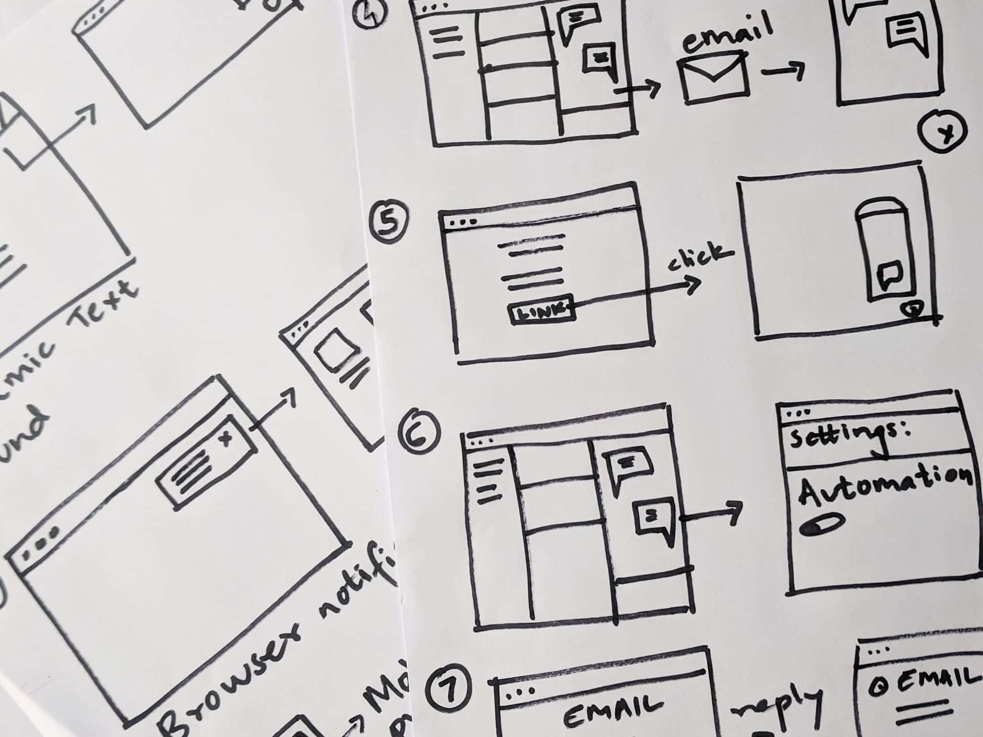
Here you can see the initial flow that re-engages the user so he/she returns to a messaging window from an email notification.
Then we moved on to solving the next main pain point by helping to minimize the number of additional messages that a user would have to exchange with the brand. We were able to address this in part by including some of the previous messages in the email to increase visibility of the full conversation and corresponding action.
Yet one of the key challenges in regards to helping brands ensure that they are able to resolve a user’s issue in a single go is the fact that not all users leave a detailed explanation of their problem. Users generally tend to start messaging the brand with generic messages such as “Hi” or “I need help”, etc.
This provides little context for the brand to be able to solve a user’s problem. In order to alleviate this problem, we have decided to use bots to collect additional information up front. You can read more about that in a previous PM spotlight on using bots in workflows.
Stage 5: Prototype Generation
Now that we had identified ‘email’ as the means for brands to contact users, and also ensure that these emails would contain the past few messages exchanged, we decided to create prototypes that we could validate with customers. The goal of this exercise was to understand:
- When to send an email to users
We considered providing brands the ability to manually send an email; or building in a mechanism to automatically send an email based on certain parameters. In order to stay in line with our goal of helping brands automate customer support, we chose the latter. - What actions users could take in the email
Given our robust bot and AI capabilities on web chat, we decided to provide a link in the email that brings users back to the browser and web chat widget, and make their entire conversation history available. By taking a hypothesis-driven approach to product development, we hypothesized that given clear prompts to bring users back to web chat, users would not reply directly to the email. Keeping the user experience in mind, we have put safeguards in place so that if a user does reply directly to the email, we send an auto-response with a link to bring them back on web chat. - What happens once users re-open the window
We decided to provide a link in the email to bring users back to web chat. The next decision we faced was where should this web chat open — on the customer’s website or on a page hosted by Helpshift? In order to identify the right solution, we conducted research sessions with several customers to understand their expectations and goals around where the link should go.
The results showed that the best experience would be to take users to the page where they started the chat. Therefore, we recommend customers to always ensure the widget is available on their website and that they don’t hide the web chat widget outside business hours.
Stage 6: Prototype Selection
Based on the feedback from customers, we refined the prototypes and selected the final version. The final feature is comprised of an automation wherein customers can configure the timeframe to prompt an email notification, and a custom URL for logged-in users.
If users don’t read the brand’s message within the specified time period, they get an email with unread messages and a link to continue the chat. Clicking on the link opens chat on the customer’s website and let’s users continue the conversation with the brand.
The feature has first and foremost been designed keeping the end-users in mind.
As soon as they click on a link, they are automatically redirected to the page where they started the chat, and their entire conversation is made available to them. The user can continue exactly where he or she left off. All of this while providing world-class security measures so that no one can access users’ conversations without their explicit knowledge.
Stage 7: Build and Release
Once we had a sense of what the feature would look and feel like, we started involving the development team. In the build and release phase, we evaluate all the edge-cases, scaling and operational challenges, and security challenges. This way we ensure that we are shipping a feature that’s highly stable and secure. In order to uncover additional use cases for our customers and ensure high security standards, while still providing an exceptional end-user experience, the additional features we incorporated include:
- Webhooks when a follow-up email is sent. This can be used in conjunction with the Helpshift API to take actions on an issue (eg. update a custom issue field).
- User-Changed APIs to ensure we are always secure. Brands can use this API to detect if a user was logged-in when he/she started chat and remains anonymous after clicking the link and vice-versa, so that brands can optimize the end-user experience while staying secure.
Fully Asynchronous Capabilities are Live! Now What?
The feature is live now and is being actively used by our customers. We are starting to get early data to support the hypothesis we originally made. As we suspected, fewer than one percent of users are replying directly to the email. This validates our hypothesis that given the right design and a compelling call to action, users’ existing behaviors can be modified and users can be guided to click on a link in the email instead of directly replying to it.
With this feature, customers are able to continue solving users’ problems even if they close the web chat widget, tab, or browser altogether.
Want to learn more?
- Additional Product Information: Helpshift Asynchronous Messaging
- Blog Post: Why You Should Rethink your ‘Live Webchat’
