Making your app users complete an action that adds to your end goal is becoming increasingly difficult. The reason being, if they don’t associate with it, they would rather switch apps than do what you expect of them. In this post, we’re going to share how you should analyze the entire user journey to improve the user experience and get more conversions.
“How do you get your users to do what you want them to on your app?”
This is one question that has been haunting app marketers forever, and we totally relate. You ask users to sign up after a download and they leave the app. You recommend a purchase to them and they abandon the app to look for an alternative. Basically, if there’s anything you want them to do – it’s rarely going to happen.
That’s where the importance of a user journey comes in.
What Is App User Journey?
A user journey is defined as a series of steps that represent how you want users to interact with your app. It involves the analysis of how users are interacting with the app to identify the weakest points in the path to conversion.
It could be hesitance in making an in-app purchase, trying out a new feature, or simply not being able to understand how to use one. Mapping the user journey from the time of download and their first session is important for your app’s growth.
What Are the Stages of App User Journey?
Here are the core steps of an effective user journey that maps the user activity from discovery to purchase.
App discovery / App awareness
Hundreds of apps appear in the app stores on Android and iOS every day. App developers need to focus on app store optimization on priority and create referral marketing campaigns that encourage the users to share the app in their circles.
App download / User acquisition
This stage in a user journey looks into what made a user download the app after discovery. Is it because there were no other options available to them, the reviews of the app, what the app had to offer, or any other reason?
Knowing the motive and the source behind an app download is important for marketers to optimize their user acquisition strategies. When you know what people are looking for, why, and how you can offer the same to them, you can personalize your marketing campaigns better. The higher the level of your personalization, the greater the conversion rates.
App developers also need to establish their brand names in the target market. They must maximize their online presence across social and other digital channels, get their apps featured on media sites popular with their users, and make sure that their potential users see the app’s value.
App onboarding / App exploration
Let’s face it, you and we don’t have to think the same way. While you might want us to write an article only in pointers, we may be the kinds who prefer in-depth posts or vice versa. The same holds true with your app users.
When a user downloads your app, they have the freedom to explore it on their own, at their own pace. Now, this may lead them to explore the features that are a unique selling point of your app or they may miss them. Giving the user entirely free reign and absolutely no in-app guidance can also result in them getting a little too overwhelmed or confused with what the app has to offer.
This is where the user onboarding flow steps in.
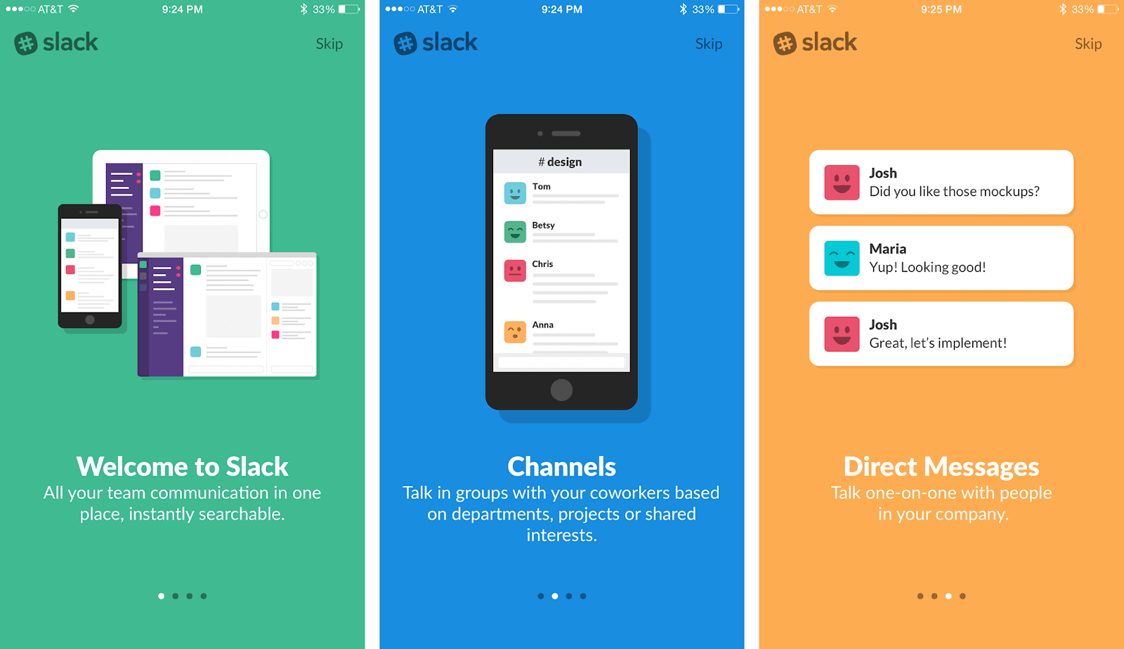
Onboarding is like giving your users a quick walkthrough of your app. From the features, it offers to how they can make the most of them, in a step by step manner. It makes exploration of the entire app a breeze for the user and assures the developers that none of the features are ignored.
For example, here’s how Slack introduces its users to the app’s features:
App reuse and purchases
According to Localytics, the average mobile app retention across all industries is 25% after 90 days. Yes, most apps have a large churn of 75% – irrespective of how good the app is or what it has to offer. Getting your users to the app after their first session is a challenge that app marketers still face. Yes, user retention problems are for real!
The primary reasons for a churn being the users found another app that seemed better to them, the app was unsuccessful at becoming their break time companion, or it could simply engage the user at the right time while they were away.
We have spoken about how in-app and outside the app communication as well as engagement are important to keep the users hooked. Be it using in-app chats, activity feeds, or push notifications, app developers need to ensure they remain at the top of their user’s mind amidst all the market competition.
App monetization
While there are apps like Candy Crush and Game of War making millions out of their users, most apps face a challenge when it comes to converting their users into paying users. The first way out that a lot of users see is to look for another app that offers similar features for free – and that’s where the first app experiences a churn.
Now one way of monetizing your app is running multiple in-app ads – but then that puts your app at the risk of not being able to deliver a great experience. Another tactic that apps take to monetize from their users is blocking out a few features from the freemium model – this doesn’t interrupt the user’s experience and if implemented properly, converts higher.
In a previous post, we discussed 10 in-app tactics that can help you monetize from your users:
- Keeps your users engaged constantly
- Work on a lite freemium model
- Personalize in-app purchase recommendations
- Use the power of social to drive conversions
- Create customer loyalty programs
- Create a dynamic pricing model to suit all users
- Cross-promote your in-app purchases
- Incorporate a subscription-based model
- Offer multiple payment modes
Re-purchase
Okay, so you’ve successfully nudged a user to complete an in-app purchase. But that’s just once, and the same user will need the same or higher amount of persuasion to be reconverted. It means that they need to see more value coming from the app and their first purchase to be encouraged enough to make another.
About 38% of users make an in-app purchase based on personal recommendations and 30% when offered a special discount on the next purchase.
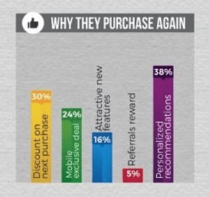
So if you want to reconvert a user to monetize higher from them, we recommend implementing multiple personalized campaigns in your app. Some of them being retargeting, user behavior based purchase recommendations, socially driven purchases, referral campaigns, and user loyalty discounts.
The trick to higher monetization is to create a loyal community of your users. Keep them engaged and improve the experience your app has to offer to them, and you’ll be able to monetize higher from each of them.
User loyalty
Continuing on the last point above, user loyalty is also hard to achieve. Imagine yourself as your perfect user. You download an app that helps you edit pictures beautifully, but then you stumble upon an ad for another app that seems to offer better editing features. What do you do?
You instantly head to the app store to see if it’s available for free or the features it offers are worth paying for. You are no longer a loyal user of the first app. Now if you download the new app, there is a high chance you become inactive on the previous one and delete it altogether.
A great way to boost your app’s user loyalty is to create a community where users keep each other driven to get the most out of what your app has to offer. For that matter, you could use the opportunity to even keep feeding your users with relevant content that encourages another session.
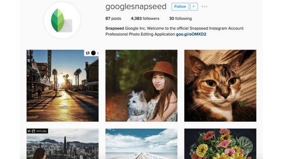
For instance, Snapseed, a photo editing app by Google regularly interacts with its users through Instagram. They also reshare some of their work, making them feel special and at the same time showcasing to other users the possibilities of the app.
How to Create an App User Journey Map?
An app user journey map is a detailed infographic that reflects the entire path of interaction between the user and the app. The map helps to look at the app through the eyes of the user, to understand their goals, motives, expectations, and fears. Journey mapping helps make communication with the user more efficient and seamless.
Having drawn up a map, you can find out the following:
- Where the audience interacts with the product. This can be a company website, ads on third-party resources, social media, etc.
- How various audience segments interact with your app.
- What stages does the user go through before buying and what goals they have.
The user journey map data should not be based on guesswork. For correct journey mapping, you need to do research and work with analytics systems. The process consists of several steps.
Step #1: Research the target audience
Begin with creating user personas that have clear goals, interests, and needs. You need to analyze the target audience and form a generalized image of a potential client based on this data.
Often completely different people buy the same product, which means there will be several characters for the path map. An 18-year-old student and a 35-year-old real estate agent may go to the same fitness club, but their goals, pricing, and service experience differ.
You need to collect detailed data on each of the characters: how they find out about the app, which competitors they turn to, why they decide to cooperate with you or refuse the service, etc. Studying the interests and values of each group in detail makes it much easier to attract and retain users.
Step #2: Create a list of interaction points and channels
At this stage, you should map all points at which the user comes into contact with your app. The more points appear on the journey map, the more detailed picture you’ll get. Examples of communication channels are push notifications, websites, search engines, other mobile apps, email marketing, social media, etc. To include all possible channels, you can do the following:
- arrange a brainstorming session within the team; use the mind mapping technique in your brainstorming session and a mind map maker to create a mind map for organizing your thoughts and ideas;
- communicate with the target audience directly;
- run online surveys;
- perform competitor analysis.
Step #3: Identify obstacles and remove them
Next, you need to move on to the difficulties and list the critical points that prevent the user from moving between the journey stages. For example, a user wants to make an in-app purchase. They are ready to enter the card number, but then they are asked to sign up. The user gets angry at the sudden difficulty, drops the purchase, leaves, and never returns to the app. An inconvenient registration process is an obstacle.
Having drawn up the list of obstacles, you need to find ways to remove them. If the user journey has changed after the implementation of new solutions, create a new journey to evaluate the result.
Step #4: Design the final user journey map
Now it’s time to combine the collected data into a single map, which may look like a table with the following data:
- a list of steps that the user takes;
- success criteria – what counts as reaching each user step;
- retention rate, i.e. the rate of returns provided that a specific step is achieved;
- conversion when moving between the steps;
- interaction point – mobile app, website, email, push notification;
- audience size at each step;
- description of the emotional state (“I seem to be confused”, “Is it possible to give up everything?”, “I am close to the goal”, etc.);
- obstacles;
- ways to remove obstacles for different interaction points.
User Journey vs Sales Funnel vs User Flow
A user journey may look similar to a sales funnel but there are significant differences.
The marketing funnel scheme depends on a specific sales business model and can have a different number of stages. In the classic version, the sales funnel corresponds to the AIDA model, which combines the four key elements: Attention, Interest, Desire, and Action. According to the AIDA funnel, you need to attract the attention of a potential consumer, arouse interest in the offer, awaken the desire to own the product, and motivate to buy.
Sometimes the AIDA formula is supplemented with one more stage: S – Permanent Satisfaction. This means that the user was satisfied with the purchase, became a regular customer, and/or shared their experience with friends. In practice, the number of stages in the sales funnel can be either up or down. However, in any case of transition to the next stage, the consumer must go through the previous one.
The user journey is not that linear. A potential client can skip certain stages and repeatedly return to previous stages. The app user journey does not end with the conclusion of a deal – it also encompasses post-sales interaction with the brand. At the same time, the goals of the consumer and their emotions are important throughout the journey.
The user journey can be illustrated by the example of a person interested in a particular product. They have done the following:
- Asked friends who have already purchased this product.
- Based on the survey, identified a suitable brand and model.
- Found an online product description and analyzed the specifications.
- Visited the forum and asked for the opinion of users.
- Found the product at the lowest price in the search results.
- Went to the online store, but did not understand how to purchase the product.
- Contacted customer support and clarified the details.
- Made a purchase and got a discount.
- Was satisfied with the product and can recommend it.
At any of the above stages, the user journey may be interrupted – the friends will express their dissatisfaction with the product, the online description will not be complete enough, the online store will not open, the customer support will not answer, etc. The user can also repeat the previous steps over and over again. When building a user journey, the brand’s task is to identify the weak points of the sales cycle and strengthen them.
User flow is another term that is similar to user journey but there are also differences. A user flow is rather a part of the user journey. It describes certain user actions taken to achieve specific goals at specific journey stages. Unlike the user journey, which considers the user’s emotions, user flow would focus on technical details. For example, at the installation stage, the user flow will refer to the sequence of the app screens, the information they contain, and the UI element that the user has to tap to proceed further.
Examples of User Journeys
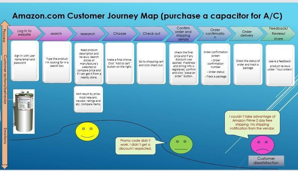
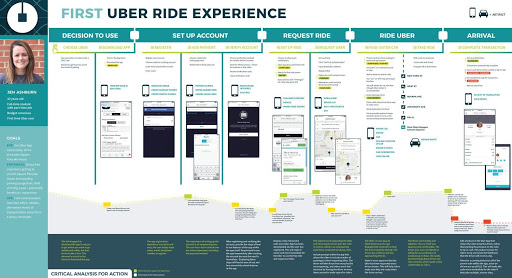
We have collected some examples that can illustrate the journey maps for famous brands.
Amazon Customer Journey Map – from the login to the customer feedback:
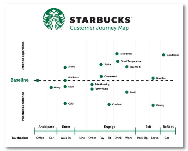
Starbucks customer journey map showing the main communication points and psychological markets that are a priority in a given situation:
First Uber ride experience from the point of view of a user persona – Jen Ashburn, a 32-year old full-time student with a part-time job:
Takeaway
No matter what stage your user is on, it is important to note here that just the app’s design and offering are no longer in the first place. It is about the experience your app can offer to its users and how consistently you can improve those over time.
The next market battleground is user experience. Is your app ready?
