Can you name a mobile app that does not send any interactive notifications to its users? We believe that such apps no longer exist, and Google search agrees with us. It is hard to imagine the modern world and user experience without push notifications and in-app messages.
While mobile push notifications are already everywhere, their closest relative, an in-app message, receives significantly less attention. This is sad because in-app messages can play an important role in the user’s decision to stay with the application or not. Additionally, they simplify the process of the user’s interaction with the app and increase its value in their eyes.
Currently, most companies send in-app messages in a chaotic manner. Most often, these are poorly targeted promotions sent when the user opens the application. This is far from what the user wants to see; most often, these pop-ups are simply annoying. However, with the right strategy, marketers can turn users from those who have just downloaded the app into loyal customers.
In this article, we are going to find out what is the difference between push notifications and in-app messages as well as highlight the different cases of using each notification type.
Difference between Push Notification vs In-App Message
Push notifications are messages that the user sees without opening the app, typically on the lock screen whereas, In-app notifications are the messages that the user gets inside the application after they have opened it. These notifications are designed to send more targeted and context-sensitive messages.
In addition to their location (outside or inside the app), push notifications and in-app messages differ from each other in the following way:
- Purpose: a push notification brings the users to the application whereas an in-app notification guides the users inside the app.
- Working principle: a push works at any time whereas an in-app works only when the application is open.
- Audience: a push is aimed at the potentially disengaged audience whereas an in-app targets the audience that’s already using the product.
- Disabling a notification: a user can always turn off a push whereas in-apps cannot always be disabled by users.
Types of In-App Notifications
Based on the location on the mobile device screen, there are the following types of in-app messages:
- As a full page message that appeals to the aesthetic tastes of the users.
- In the center of the screen. This format is good for providing users with information that they definitely should not miss.
- As a bottom banner for unobtrusive communication.
- As a top banner that creates the effect of a push notification.
Each location-based type is useful for different reasons, but some positions see better results when it comes to engagement and conversion. Full page in-app messages can be extremely effective if they are visually appealing. After all, this is exactly what consumers pay attention to when choosing applications. While some types of in-app notifications are useful for increasing brand loyalty and obtaining extra information about the user, others are aimed specifically at the user’s purchase. Notifications in the center of the screen are on average the most popular, as they are more likely to prompt immediate action. However, everything depends on your marketing goals.
Additionally, depending on the type of information that they deliver, in-app notifications can be transactional and non-transactional. Transactional messages are related to the application itself, its user interface and functionality. They inform users about how to use the app and how to get the most out of its features. Non-transactional messages are related to everything else, including special offers and new feature announcements.
Read more: What Is In-App Messaging and How to Use It to Improve User Retention
Push Notifications Use Cases
Push notifications are used in the following cases:
- To promote the app. These messages inform the user about the brand’s special offers and discounts, e.g. holiday or seasonal discounts. Example: “Cooler weather means it’s a jacket time! Here is our most popular style. All jackets are now 20% off.”
- To inform. These messages are triggered by various activities and transactions that the user has made within the product. Example: “Your video is ready to view. You can now watch it.” by Facebook.
- To deliver location-specific information. These notifications are based on the user’s current location and their purpose is to deliver information that is specific for this location. Example: “Welcome to New York! See where your friends have been in the city.” by Facebook. Facebook users can choose to receive such messages each time they visit a new city.
- To retain users. These messages encourage the user to stay and continue using the product. A good example of a retention message is an abandoned cart alert in e-commerce apps. Game developers also actively use retention push notifications in order to bring players back to the game.
In-App Notifications Use Cases
In-app notifications can be sent to users in the following cases:
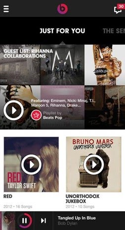
- Personal recommendations. Personalization is crucial in building customer loyalty. An application can collect information about the user’s behavior and preferences. By collecting and analyzing this information, you can offer the most suitable content and recommendations based on real-life interests. For example, the Beats Music app creates a playlist based on the songs you’ve previously listened to. Instead of just spamming all users with notifications of updates and recommendations, they use the “Just for You” notifications on the main screen.
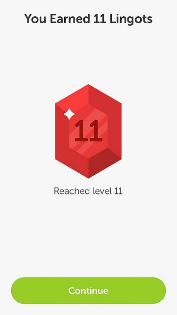
- Gamification elements. In-app notifications are a perfect form to encourage users. This can be done by using notifications similar to gaming achievements, such as badges, stickers, and other level-up awards. For example, Duolingo gives its users the “Lingots” currency for specific achievements in mastering a foreign language.
Additional reading: Is Gamification the Only Way for Apps to Survive?
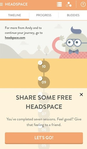
- An easy way to tell friends. All app creators want their users to share with friends. Here’s an example from the Headspace meditation app. For users to start talking about you, you need to provide them with a convenient opportunity. It’s enough to create an in-app message combined with some event in the application: for example, a user has completed a meditation and can share it with friends.
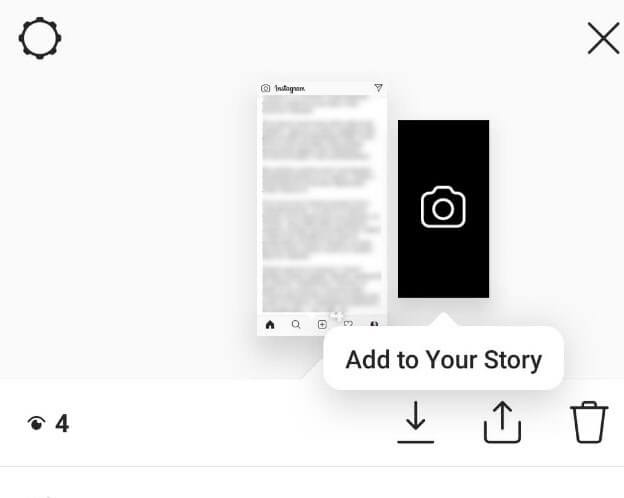
- Short tips. Most users do not like reading guidelines on how to use the product. In-app notifications are a great opportunity to show small tips and short contextual instructions. As a result, the users will instantly adopt the correct experience of using the app, without interruption and without going to a separate screen to read the manual. Such built-in guidelines can also serve as a part of the user onboarding process. Here’s an example from Instagram:
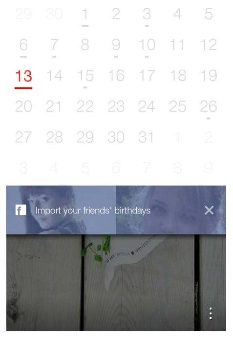
- Adding friends. If your product is based on user interaction, you can use in-apps to push the users to the desired action. Show them how easily they can interact with others. The Any.do Cal app suggests importing information about your Facebook friends to the calendar. Thus, it tries to get closer to users by creating a personal space in a product that is still unknown to them.
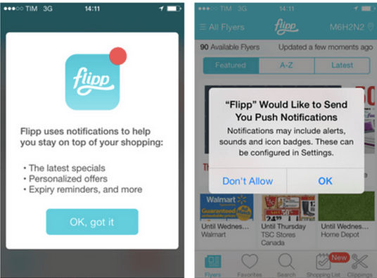
- Getting the user’s consent to receive push notifications. You can use in-app notifications to ask the users whether they want to get push messages and explain which benefits they can get if they enable the notifications. Here’s an example from the Flipp app:
- Asking for feedback. It is easier to get feedback from users when they are engaged or have just used your application. In-app notifications work well to get you that valuable feedback from your users.
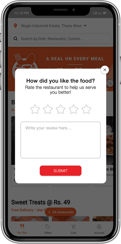
- Inform about new features. Let your users know the enhancements and updates in your app while they are actively using it.
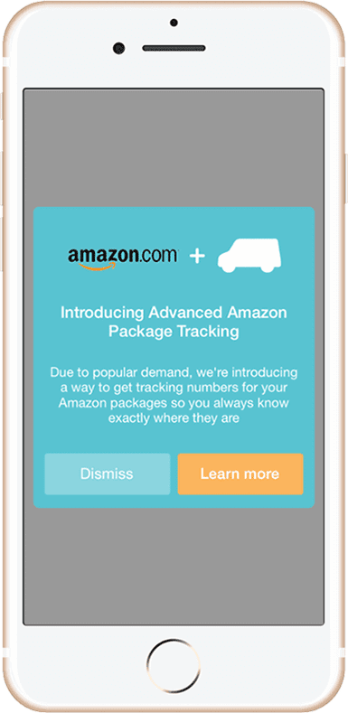
In-App Message Best Practices
The key benefit of an in-app notification over a push message is its high conversion rate. In-app messages can increase LTV, app usage, and app retention.
The number of users can drop sharply due to inappropriate or too salesy notifications in the application. So how can you make them effective and unobtrusive?
Here’s how you can get the most out of in-app messaging:
Choose the right moment
In-app messages should appear at the right time. For example, if your potential customer places an order, and you suggest that they take a survey, it will not cause anything but irritation. Sending messages to users when they open the application is not the best time to attract them. In-app marketing should be based on user behavior. This requires you to understand and capture the behavior of the users, so you can later launch in-app campaigns in real-time.
The best time to show in-app notifications is after completing an important step, e.g. a level in the game. If a media brand wants to keep you in the application, it will never send you random messages. The notifications will be extremely timely and based on your recent activities. For example, if you’ve just finished watching the fourth season of your favorite TV show, then this will be the best time to send you an offer that will give you access to the new season.
Use geo-targeting
When reaching out to people in various cities, countries, cultures, and time zones, it is crucial that you consider the geolocation information in your in-app marketing campaigns. This is especially useful for businesses with physical locations. If your user frequently travels, you can detect their current location. In case your store is located nearby, you can use in-app messaging to inform them about deals and special offers that are relevant for that location. A timely proposal may interest users and increase conversion.
Do not request any extra user data
Sometimes a user wants to write a review or recommendation and refuses to do it at the last moment because they do not want to give their email. In general, people are very reluctant to share our personal data, so in-app messages should avoid such requests whenever possible. If additional personal contacts are necessary, for example, to communicate with the audience outside the application, then it is better to request them before starting a conversation with the user.
Give your users a warm welcome
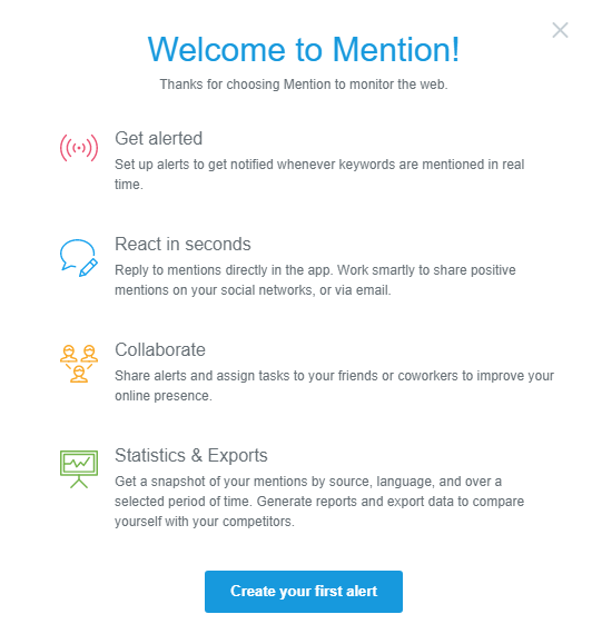
Nobody wants to spend a lot of time studying the app’s functions, and that is why you should send in-app greeting messages to users. With these notifications, you can answer most of the questions that would otherwise be sent to your team. For example, Mention uses welcome messages to provide new users with information about the basic functions of their product. The CTA button at the bottom of the alert directs the user to the next step.
Choose the right UI template
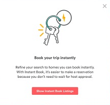
Important messages deserve “loud” announcements. If you are trying to tell users about price updates, you should post a notification in the center. You must make sure that everyone reads your message. Other relevant and urgent information can be provided through catchy timely announcements. Here’s a notification from Airbnb that directs users to an easier way to book rooms:
Comply with high content standards
As soon as you set up your message delivery system, start considering texts that will be sent to different segments of your target audience. In-app notifications are written in the same way as emails, meaning that your content should also be concise and interesting to the reader.
Create your messages with the following thoughts in mind:
- If you use a system in which there is a place for a title or topic, do not forget to attract the users’ attention with questions and numbers.
- Set up message delivery on several channels so that you know who has already read a notification.
- Use the CTA elements, if appropriate.
- Include images and videos in your posts to make them “livelier”.
Test the results
Split tests help you understand how effective your in-app messages are. You can try different types of content, colors, and styles for your alerts to see what your users are most involved with. By picking a perfect message, you can (and should) keep track of how your users respond to it. Use the closed-loop service to see data about impressions, CTR, conversions, and lifetime value associated with different campaigns. With this approach, you don’t have to spend time developing notifications that won’t bring any conversion.
Over to You
Now you are aware of the differences between push and in-app notifications. Here’s a brief summary:
- Pushes are shown to the user outside the application whereas the in-apps are displayed inside the app.
- A push notification is aimed at disengaged users and its purpose is to bring those users back. On the contrary, an in-app deals with users who are already engaged and actively using the product. An in-app notification guides the users inside the application. However, like a push, an in-app can also be used for marketing purposes.
- It’s always possible for a user to deactivate a push. On the contrary, a decision whether a user can deactivate an in-app message is made by app developers.
- Pushes always pop up on the mobile device’s lock screen or at the top of the screen when the device is unlocked. In-apps can appear at any part of the screen.
