Targeting mobile users is no longer just an internet marketing trend. The mobile application market is a large-scale competitive arena in which hundreds of players die every day. Developing and keeping afloat a popular, profitable app has become an extremely difficult task, especially for a beginner. In such conditions, you should use all possible ways to increase traffic and the percentage of downloads. One of the ways is to include the creation of a mobile app landing page in your app marketing strategy.
The creation of a landing is a powerful argument in the tough competition of mobile apps. If you are not at the top, then a well-thought-out app landing page will bring you more installs. In this article, we’re going to find out what is a mobile app landing page, which purpose it serves, and which important elements it should include for higher conversion.
What Is a Landing Page?
A landing is a web page for collecting the visitors’ contacts or selling products. As a rule, it is a one-page site that briefly presents information about a service or product. Visitors get to landings through contextual, banner and targeted advertising as well as email newsletters. The main task of the landing pages is to convert a visitor into a lead or a buyer with the incentive to complete a target action. Such an action may be purchase, subscription to the newsletter, registration, downloading, sending contacts, etc.
How Does a App Landing Page Work?
There are several options for targeted actions on the landing:
- Subscription. Collecting a database of potential app users.
- Getting a bonus. You can give your users a bonus both before and after the launch. It can be a promotional code, which makes it possible to try paid options for free.
- Installation link. Everything is clear here – links to the app stores in the form of icons.
Main Purpose of a App Landing Page
An app needs a landing at all stages of its life cycle:
- Before the launch – to check the engagement of the audience before the release of the product.
- During the launch – to advertise and offer installation.
- After the launch – to keep the audience interested in the application and provide detailed information that could not be found in the description on Google Play or in the App Store.
And here is why your app needs a landing page:
- Search traffic is a significant channel for increasing the number of downloads that cannot be ignored, especially in the long run. Proper setup, skillful calls to action, and regularly updated content will turn the landing into your own mini-store for selling the app.
- A mobile app landing page allows you to collect a subscription base and find beta testers at the product development stage.
- After launching the app, you can easily turn the subscription landing into a selling one by replacing the capture form with the “Download Application” buttons and changing the CTA. This way you streamline app installation, improve organic user acquisition and boost re-engagement. Once added to the website, you’ll get this automatically:
Additionally, you can use the mobile app landing page for:
- advertising,
- market research,
- A/B testing,
- promotions and competitions,
- growth of virality and recognition,
- keeping the target audience interested,
- user support,
- extra information that could not be found in stores, etc.
All this makes an app landing page a valuable link in the product promotion strategy at all stages of the app’s life cycle.
How Do You Create a Landing Page for an App
App landing page design should include the following elements.
Initial screen
The mandatory elements of the initial screen are:
- application logo with a name,
- descriptor,
- heading,
- subheading,
- application interface image,
- call to action,
- application form,
- shop icons.
The initial screen should clearly show the purpose of the app. This is the most viewed part of the page. Each visual element should tell the story of the app and show its benefits.
Benefits in the form of triggers
Triggers are designed to grab attention. They briefly describe the app’s functionality (3-4 words per title and no more than 10 words in the description), and visibility is achieved through the use of images or icons.
Additional benefits and getting the user familiar with the interface
You can repeat this block several times. Some app landings are made entirely of such benefits. What is the best way to place the text about benefits? Put the main idea in the heading and give a more detailed description below. As an example, consider a weight tracking app. This app has the “tracking” functionality, but this is not enough, you need to tell in more detail what its benefits are.
- Headline “Exact Daily Calories”
- Description “Tracking will help you find out the daily calorie intake: note what and how much you eat and drink.”
- Next to the text, you can show a picture of how the calorie count looks like in the app.
Read more: An Ultimate Guide to Writing App Descriptions That Sell
Media reviews and references
The most commonly used format is “short review (1-2 sentences) + name and link to a social network”, similar to the classic block of reviews for a landing page. It’s also possible to show the logos of media that reviewed your app, with links to those reviews. Speaking of logos, make sure to create a logo for your brand too and add it to your landing page.
Social media links
These links are used for app reposts. Make sure that the page is correctly displayed when reposted (for this you need to configure meta tags) and the benefits are shown in the text. Just linking to social media platforms makes sense only if they are interesting and are regularly updated.
How to Create a Highly Convertible App Landing Page
Here are some tips that can help you convert more customers for your app.
- Show your product in action. One of the most interesting features of a landing may be the answer to the question “How does it work?”. After all, not only “what” you are selling but also “how” this product works is important. The main point is to show this in a fun and interesting way, so the visitors will be even more drawn into communication with your company. For example, you can place some kind of interactive application, some prototype demonstrating the functions of the app. Additionally, you can record an explainer video with a fascinating plot. Users love videos because this is the fastest and easiest way to get the required information. You may also want to get the help of an expert Android or iPhone app development company to create a flawless strategy for your landing page.
- Use emotions. Experienced salespeople are well aware that emotions make it much easier to persuade a customer to buy. Logically, the potential buyer will find a lot of excuses and doubts, but emotionally, they think completely differently. Therefore, an important aspect of any selling page is its emotional appeal. For example, pictures and background images can become emotional clues that will convert the potential user. You can portray the user’s imagination, guess their dreams, and earn their trust.
- Manage inbound traffic. Of course, you need to manage people coming to the page or, more precisely, direct their actions. This is important because, as part of the advertising campaign, you need to help users get the information they need and convert them into leads.
- Use animation. Animated inserts will help make your app landing page more interesting and definitely attract the attention of your audience. But please do not overdo it. Animations should be interesting and vivid, but not so that the visitor forgets about the main purpose of their visit.
Apps with Best Performing Landing Pages
We have prepared a list of apps that have converting landing pages and that you can use as examples or role models when designing your app landing page.
Judopay
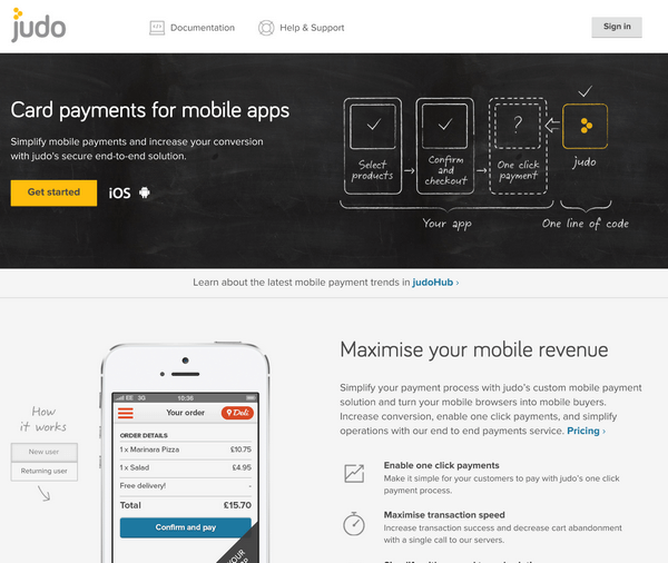
The landing page of this billing app for mobile websites shows how the app works and which benefits it offers in the form of understandable graphics and short, crisp texts. The reader can easily spot what the app does – “simplify your mobile payments” – and what the user will get – “increase your conversion”.
Paddle
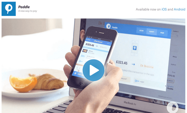
One more billing system for software products, Paddle shows the visitors a short explainer video on their landing page that demonstrates how the product works and why the viewer should choose it. A video on the app landing page can be a time-saver for busy people, especially for those who would use Paddle – the app is designed for executives and financial departments.
Loudie
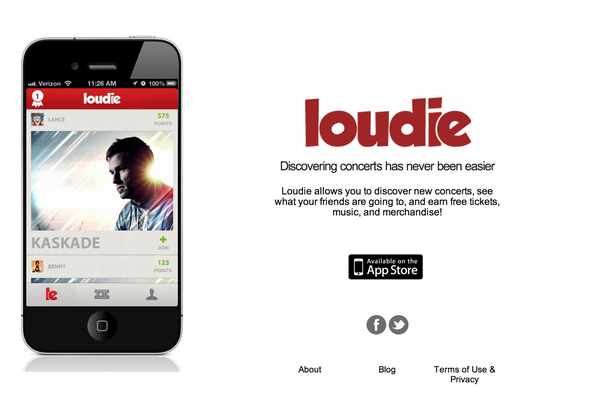
This app helps to discover concerts and live shows nearby. Its landing page is easily readable and minimalistic. There is no useless information here, the accents are clearly laid out, so the user will always understand what to do next.
Human
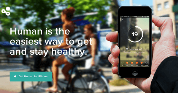
Human is an activity tracker app that helps people become healthier. To do this, you need to just walk for 30 minutes a day. And the app simply counts down this time. It is convenient, and most importantly – good for health. The landing page design just projects this message – “Live a healthy and happy life.”
Yidio
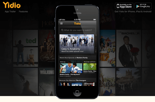
The landing page of the Yidio video streaming app appeals to the visitors’ emotions. The page contains a huge video, so huge that it is impossible to miss. It is perky and interesting, easily catches and converts the visitor.
ParkMe
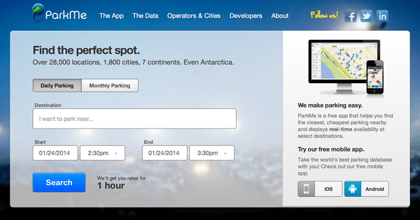
On its landing page, the ParkMe app offers the user to try out its service right away. It contains a form via which the user can book a parking spot in any corner of the world – “even Antarctica”. The purpose of the app is also clearly laid out – “We make parking easy.”
Periscope
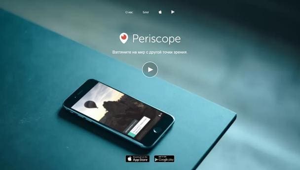
Periscope is a popular app for broadcasting and watching live videos. The landing has a blue background and a short video demonstrating how the app works. This solution is 100% consistent with the product, it looks organic and stylish. It’s easy to understand the app value, and this motivates the user to download it through 2 buttons of the App Store and Google play at the very bottom.
Spendee
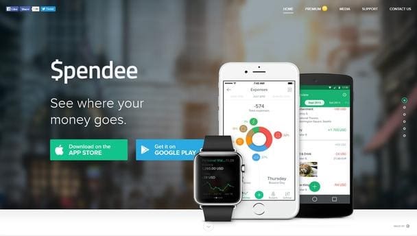
This personal finance management app has a professionally looking app landing page design. The animated scrolling that turns the site into a presentation is smooth and does not freeze. The landing page is well optimized, and the chosen color scheme is pleasant to the eye.
Oggl
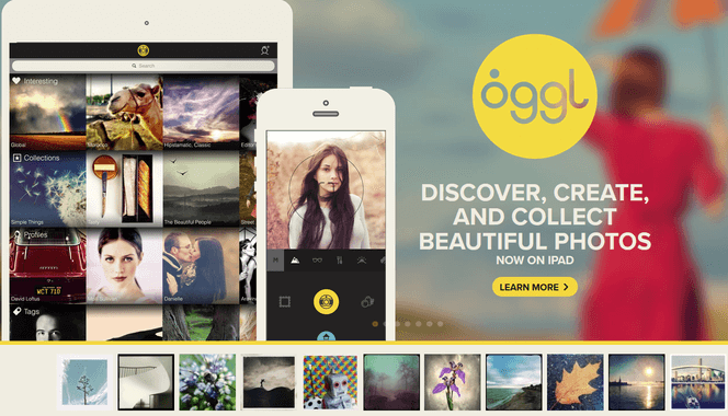
Oggl is an app with which you can apply various filters to photos on your smartphone. Its landing shows beautiful examples of photos processed with this app, so the user immediately sees the result and quickly makes a purchase decision.
Obaby
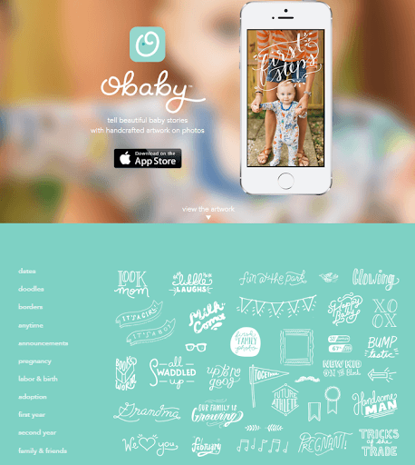
This app allows parents to add beautiful artwork to photos of their babies. The landing page design is minimalistic, with a short description of what an app does and examples of all types of artwork available. The viewer can browse the artwork and decide if it’s suitable for their photos.
App Landing Page Builders
- Wix. A platform that allows creating, designing, managing and developing a web presence. To create a landing page for your app, explore their HTML landing page templates. Price starts from $13 per month.
- Unbounce. A drag-and-drop landing page builder with 100+ quick-to-use templates. Price starts from $79 per month.
- Instapage. A platform designed to create, personalize and optimize post-click landing pages and experiences at scale. Price starts from $199 per month.
- Appsite. A landing page generator that enables building and launching a website for your app.
- Wishpond. A platform that enables marketers to create landing pages and contests, track leads, send emails and more. Price starts from $49 per month.
- Lander. Free landing page creator with 100+ ready-made landing page templates.
- Landingi. An easy to use landing page builder with 200+ customizable landing page templates. Price starts from $29 per month.
- Leadpages. A landing page creator with accompanying suite of lead generation and opt-in tools. price starts from $25 per month.
- Shortstack. An all-in-one software for creating unique landing pages, running social contests, sending emails and analyzing results. Price from $99 per month.
- Ucraft. A free landing page builder that allows creating a landing page in 7 simple steps.
- GetResponse. An email marketing and online campaign management platform with a landing page builder feature. Price starts from $15 per month.
App landing page can be seen as a kind of a bridge between the web and the mobile application environment that allows collecting visitor information before launch and post-launch and redirecting traffic to the mobile app. Without an attractive landing page, you won’t be able to get the most out of promoting your app on each stage of its lifecycle. So if your mobile app still doesn’t have a high converting landing page, it’s a perfect time to get started now!
